Best Interior Paint Colors for Coastal Homes in Maine
Discover the best paint colors for coastal homes in Maine.
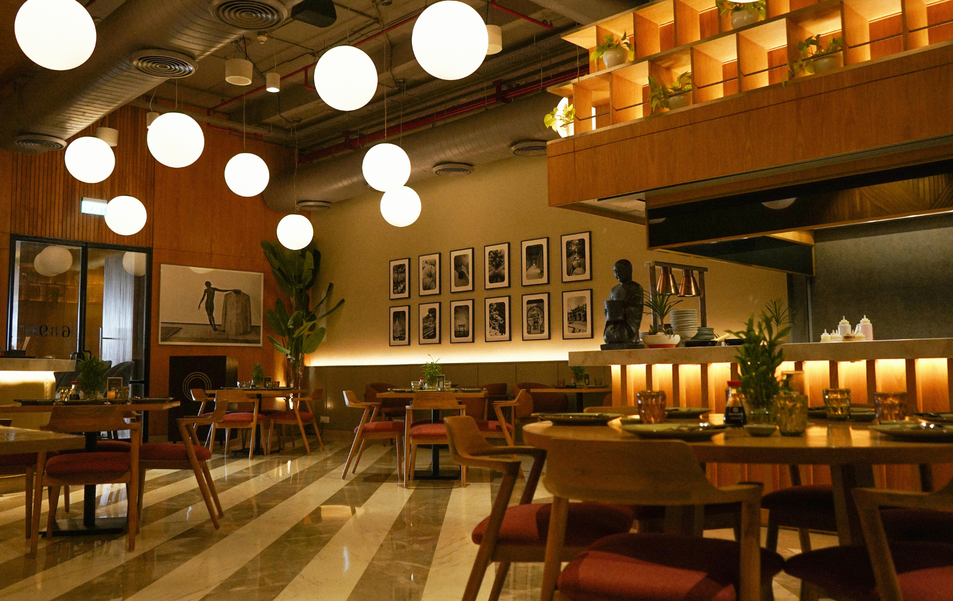
The quickest way to transform a Maine coastal home is with the right interior paint palette. Coastal light is powerful and changeable, fog can cool a room’s tone, and salty air and humidity challenge finishes. The best interior paint colors for coastal homes in Maine are crisp whites, sandy neutrals, fog washed grays, sea glass greens, and ocean blues used with discipline. At PNB Interior Design, Inc., we specify colors that stay beautiful through every season, flatter shingle and timber architecture, and feel calm beside views of granite ledges, pine woods, and open water.
How Maine light shapes color
Maine’s latitude and weather shift color more than most places. Summer brings long days with bright, icy light that can make cool whites feel sterile. Winter brings short days and low angled sun that warms neutrals but can flatten blues. Fog filters daylight toward blue gray, which can make already cool grays read cold. Northern exposures lean cool all year, while southern exposures intensify warmth and glare. This is why the same swatch looks different room to room. We evaluate exposure, flooring tone, and trim color together before choosing a wall color and sheen.
Humidity and coastal air also matter. Bathrooms, mudrooms, and entries near the shore need moisture resistant formulas and scrubbable sheens. In living spaces, eggshell and satin balances cleanability with a soft, elegant glow, while matte hides wall imperfections in older homes.
The coastal core palette
Crisp coastal whites
White walls bounce precious winter light and deliver a clean backdrop for art, wood, and woven textures. Choose whites with the right undertone for your trim and flooring. A neutral white with minimal blue keeps rooms bright without feeling clinical. A softly warm white works beautifully with knotty pine, white oak, or honeyed antiques. Use clean whites on ceilings to lift height and keep beadboard looking fresh.
Where to use: whole house walls in smaller cottages, ceilings throughout, trim and built ins where you want sharp definition against deeper wall colors.
Soft ivories and creams
If your exposures are cool or your furnishings are earthy, creamy whites soften the edges. They flatter marble veining, unlacquered brass hardware, and warm limestone. In winter light, creams prevent rooms from feeling flat. In summer, they read sunlit rather than yellow.
Where to use: living rooms with north light, libraries with wood beams, bedrooms where you want warmth without color.
Sandy and oat neutrals
Inspired by beach sand and weathered rope, these mid tone neutrals provide calm backgrounds that enrich texture. They pair with wicker, seagrass, rattan, and driftwood, and they transition gracefully between white trim and darker cabinetry. Because they carry a hint of brown rather than gray, they stay inviting during gray weather.
Where to use: open plan living spaces, primary bedrooms, hallways that connect wings of the house.
Fog washed grays and driftwood tones
Coastal grays for Maine work best when they are softened with a touch of warmth. Think sun bleached dock boards rather than cold concrete. These hues complement nickel and stainless fixtures, porcelain countertops with gray veining, and slate floors. They are excellent for secondary spaces where you want a tailored, quiet mood.
Where to use: laundry rooms, guest bedrooms, stair halls, media rooms where you will add layered lighting.
Sea glass greens and sages
Sea glass colors tie interiors to spruce and fir woods and tidal shallows. Muted sage, eucalyptus, and sea foam are restful and sophisticated. Because they sit between blue and green, they flex with changing light and work with both warm and cool metals. In small doses they refresh a neutral house; in larger rooms they become the gentle color signature of a home.
Where to use: kitchens with white or natural wood cabinetry, sunrooms, primary baths, home offices that need calm focus.
Ocean blues from sky to navy
Blue is the natural accent of a Maine coastal palette. Pale sky blues open small rooms. Mid tone mineral blues feel classic and suit shingle style architecture. Navy brings depth and elegance, especially on cabinetry and built ins where durability matters. Blues harmonize with polished nickel, chrome, and crisp white beadboard, and they hold their color under strong summer sun.
Where to use: dining rooms with white trim, kitchen islands, mudroom lockers, powder rooms where a bold statement feels memorable.
Room by room recommendations
Entry and mudroom
These are the workhorses of a coastal house. Choose scrubbable finishes and colors that hide scuffs from sand and boots. Warm sand or driftwood gray on walls with semi gloss white on beadboard and doors keeps the space bright and practical. If the entry is small, use a soft white on walls and a mid blue on the door interior for a welcoming focal point. Floors will reflect color into the space, so sample beside slate or brick.
Living room
For rooms with a water view, let the view lead. A neutral envelope of creamy white or sandy beige allows the landscape to supply the color. Add depth with a fog gray on a fireplace wall or built in backs. In rooms without a view, consider a pale sage that reads fresh in summer and cozy in winter. Layer lamps and sconces so the color stays flattering after dark.
Kitchen
In coastal kitchens we favor light but durable palettes. Walls in a soft white keep the room luminous through winter. If you want contrast, paint the island in navy or mineral blue. For a quieter look, try a driftwood gray on base cabinets and white on uppers to lift the sightline. If your room faces north, a warm cream on walls and a mid green on cabinetry adds life without trendiness. Specify enamel formulas or cabinet grade coatings for durability.
Dining room
Dining rooms carry color beautifully because lighting is controlled. Navy, mineral blue, or deep sage on the walls with white crown and wainscot is timeless. If your dining room is open to the kitchen, repeat the island color on the walls at a lighter value to maintain harmony. For a cottage scale room, a pale coastal blue on the ceiling above white walls adds charm.
Bedrooms
Bedrooms benefit from colors that calm the eye. For primary suites, soft oat neutrals or light sages are ideal. In guest rooms, pale sky blue feels airy and reads well with crisp white quilts and woven textures. If you crave drama, use a deep blue or moss green on a single headboard wall and keep the other walls a gentle white. Choose eggshell or matte for a restful surface.
Bathrooms
Humidity makes paint selection critical. Specify moisture resistant formulas with mildew inhibitors. In small baths, soft white or pale gray keeps the space open. In windowed baths with tree or water views, sea glass green ties the palette together. For a bold powder room, deep navy or charcoal pairs with brass mirrors and sconces for a classic maritime feel.
Home office
Color affects focus. Muted greens and mineral blues reduce visual noise and improve concentration. If the space shares a view with a living area, choose a related neutral and use color on cabinetry or the back of shelving to avoid a jarring shift. A satin or eggshell sheen withstands books and equipment without glare on screens.
Stair halls and landings
These are color connectors. A warm neutral or refined white makes art pop and keeps transitions bright. If you use color on treads or risers, keep walls quiet. Consider painting the handrail a driftwood or charcoal tone for definition.
Pairings that always work
White walls with navy accents is a coastal classic that never dates. Sandy neutral walls with sage cabinetry creates a natural, collected look. Driftwood gray walls with matte black hardware feels tailored in modern cottages. Creamy walls with unlacquered brass and walnut add warmth to overcast winter days. Pale blue ceilings over white paneling reference sky and surf without kitsch.
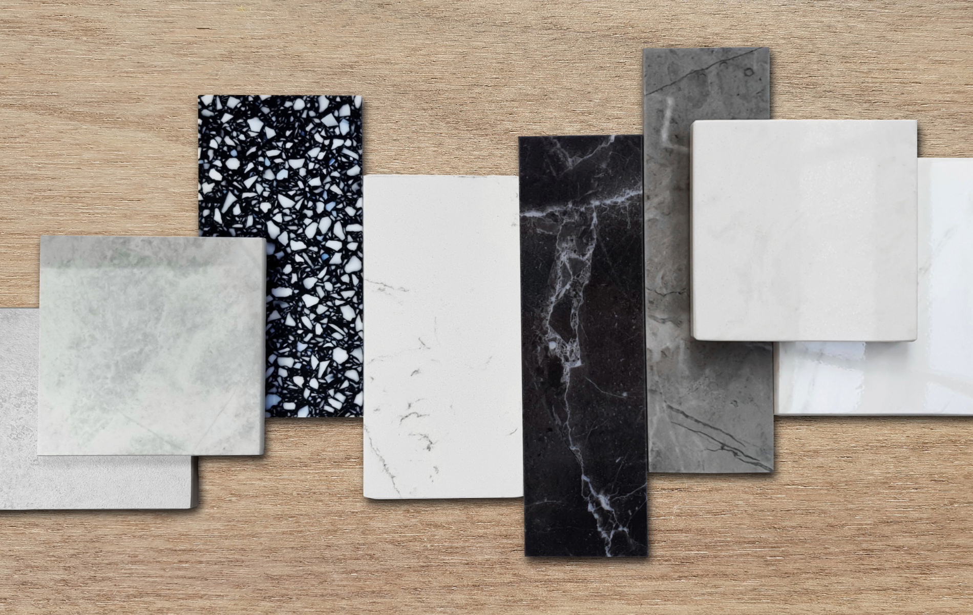
Finish and sheen guide for the coast
Walls in living spaces do best in eggshell or satin for wipeability. Ceilings should be flat to hide seams and maintain a quiet plane. Trim looks best in semi gloss for crisp edges and easy cleaning. Cabinetry requires a hardwearing enamel. In bathrooms and laundry rooms, use moisture resistant wall paint and mildew resistant primers. In mudrooms, consider satin for walls and semi gloss for beadboard and doors to stand up to grit and sand.
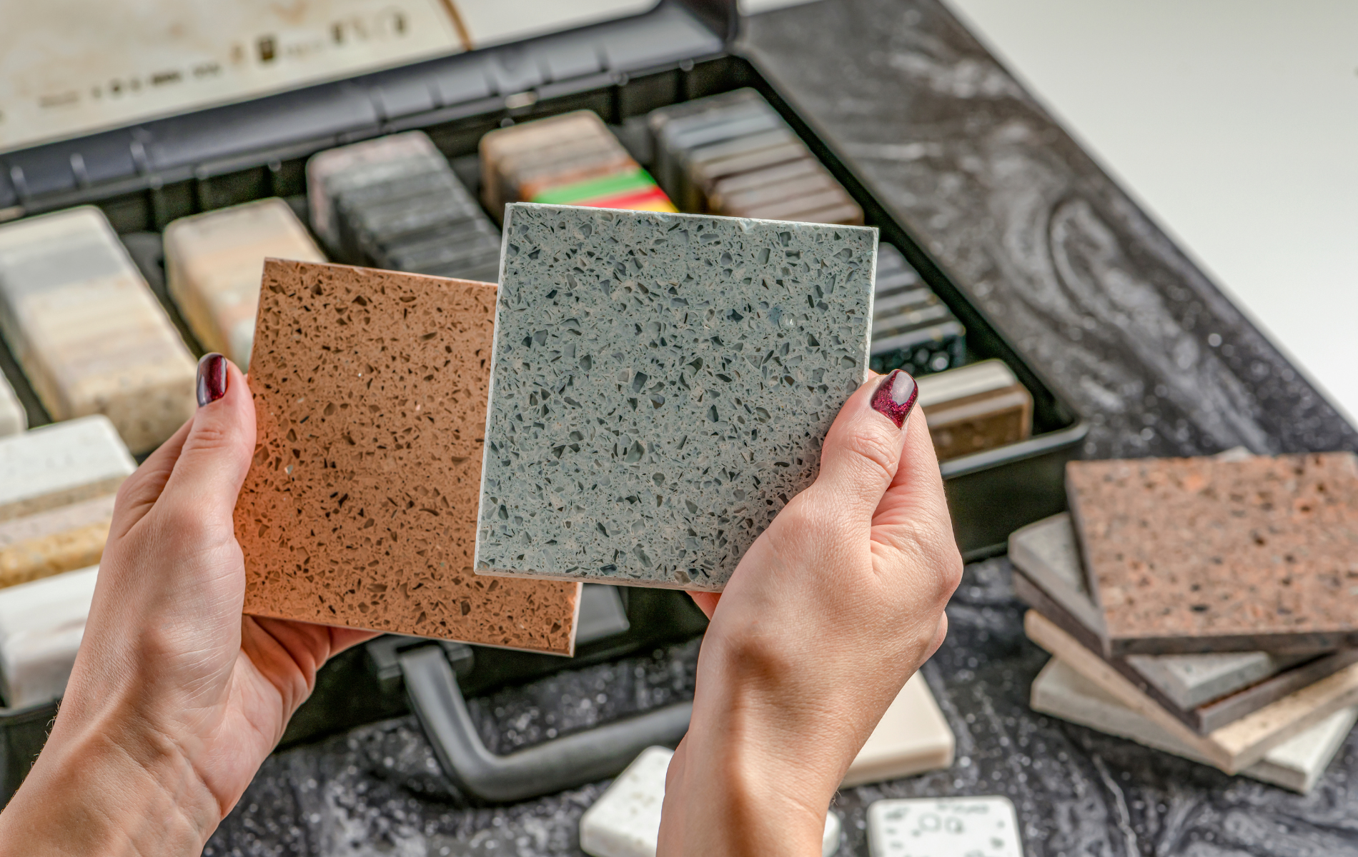
How to sample like a pro
Sample large. Paint at least two foot squares on multiple walls. If you cannot paint the wall, order oversized peel and stick samples. View the color at dawn, midday, and dusk, and under night lighting. Hold samples beside fixed elements like stone, tile, flooring, and countertops. Look at the trim color next to the wall color; undertones must agree. If a favorite shade is too cool, drop one value warmer or choose the same hue with a touch of brown. Never choose from a phone screen alone.
Three quick case studies
Blue Hill shingle cottage
We brightened a compact waterfront cottage with a neutral white on walls, warm white on ceilings, and driftwood gray cabinetry. A sea glass vanity in the hall bath tied the interior to the view. Durable satin finishes and moisture resistant formulas kept the palette fresh through foggy seasons.
Portland townhouse
A contemporary townhouse overlooking Casco Bay used a sandy neutral in the open plan living level, with a mineral blue kitchen island and crisp white trim. The primary suite shifted to soft sage for calm, while the powder room carried a deep navy that felt intimate under pendant light.
Camden farmhouse
This historic home needed warmth for winter. We specified creamy walls, soft white trim, and a moss green library. The mudroom used a darker driftwood on built ins to hide scuffs. The palette felt classic and belonged to the architecture while reading bright on short days.
Common mistakes and how to avoid them
Choosing a cool gray because it looks good online often results in a cold, flat room in Maine light. Pairing a blue white trim with warm walls creates a dingy cast. Painting every room a different color fragments small homes. Ignoring sheen leads to walls that scuff or trim that looks dull. Skipping large samples is the fastest path to disappointment. Each mistake is avoidable with testing and a disciplined palette.
FAQs
What interior paint colors work best for Maine coastal homes?
Crisp whites, sandy neutrals, driftwood grays, sea glass greens, and ocean blues create a timeless coastal palette that works with changing light.
Are bold colors appropriate in small coastal cottages?
Yes, in measured doses. Use navy on an island or a powder room, deep green on a library wall, and keep adjacent rooms lighter for balance.
How do I keep white from feeling sterile in winter?
Choose a softly warm white and layer wood, woven textures, and warm metal finishes. Add warm lamp light at night to keep the tone inviting.
Which finish should I use in humid rooms?
Use moisture resistant wall paint in satin or eggshell, and semi gloss for trim and cabinetry. Proper ventilation is essential.
Do I need different whites for trim and walls?
Often yes. A clean white on trim provides contrast, while a slightly warmer white on walls keeps rooms comfortable in cool light.
How often should interiors be repainted near the coast?
Typically five to seven years for walls, sooner for high traffic entries and baths. High quality primers and topcoats extend life.
How do I coordinate colors across an open plan?
Select one base neutral for walls, then add one accent family such as navy or sage for cabinetry and built ins. Repeat materials and metals for cohesion.
Contact Us
If you are updating a coastal home in Maine, PNB Interior Design, Inc. can build a palette that stays beautiful in every season and suits your architecture. Schedule a color consultation or full service design.
Massachusetts office: 508 328 3231
Maine office: 207 374 7164
Email: pnb@pnbinc.com
Website: PNB Interior Design – https://www.pnbinc.com
Internal links
Interior Design Services – https://www.pnbinc.com/services
Contact – https://www.pnbinc.com/contact
Portfolio – https://www.pnbinc.com/portfolio
External links
Benjamin Moore Coastal Color Collections – https://www.benjaminmoore.com
Sherwin Williams Coastal Color Ideas – https://www.sherwin-williams.com